The challenge
Investor interest was real, but their vibe-coded app and brand looked generic.
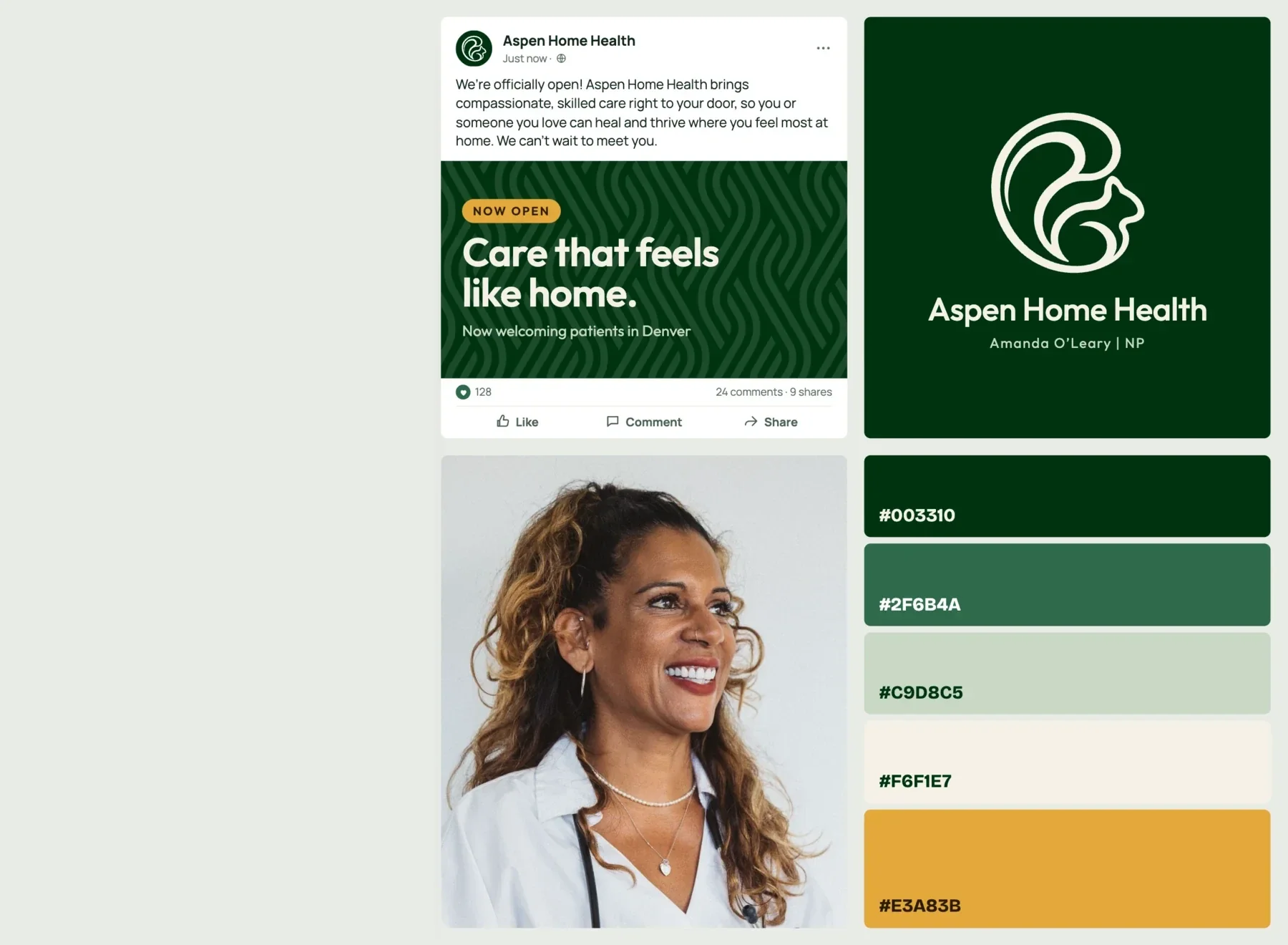
Aspen was looking to raise capital to build their home healthcare app. The product concept was solid, but the brand around it looked generic and old. They wanted something professional, modern, and recognizably theirs.


The new Aspen
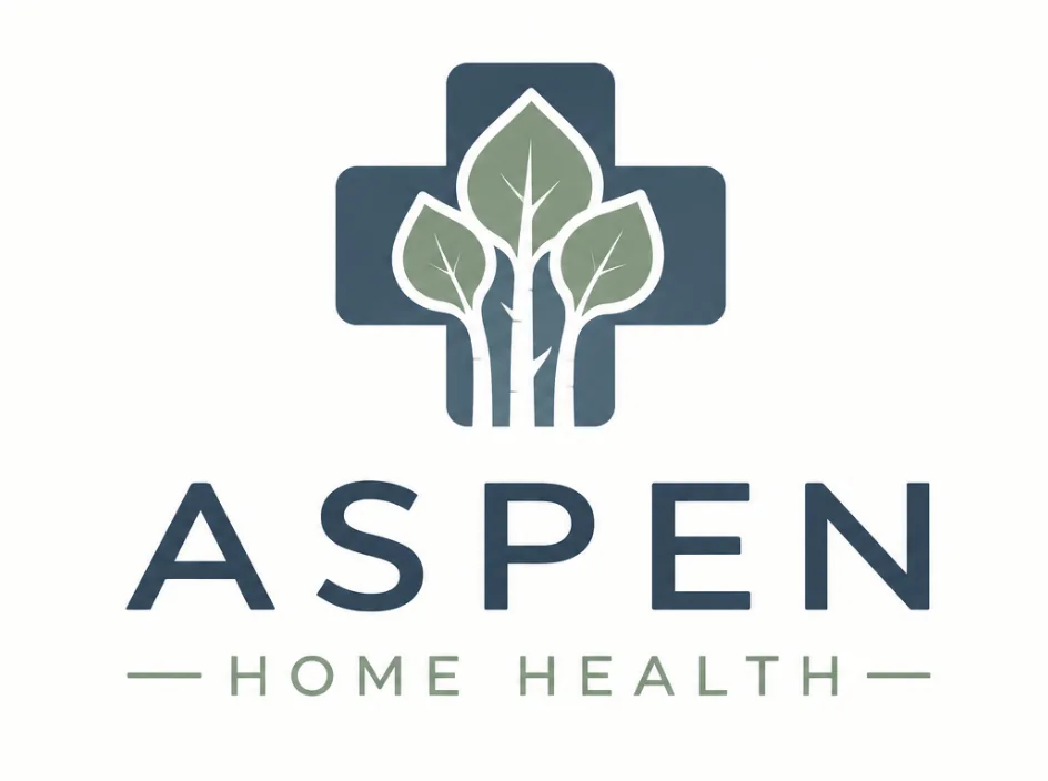
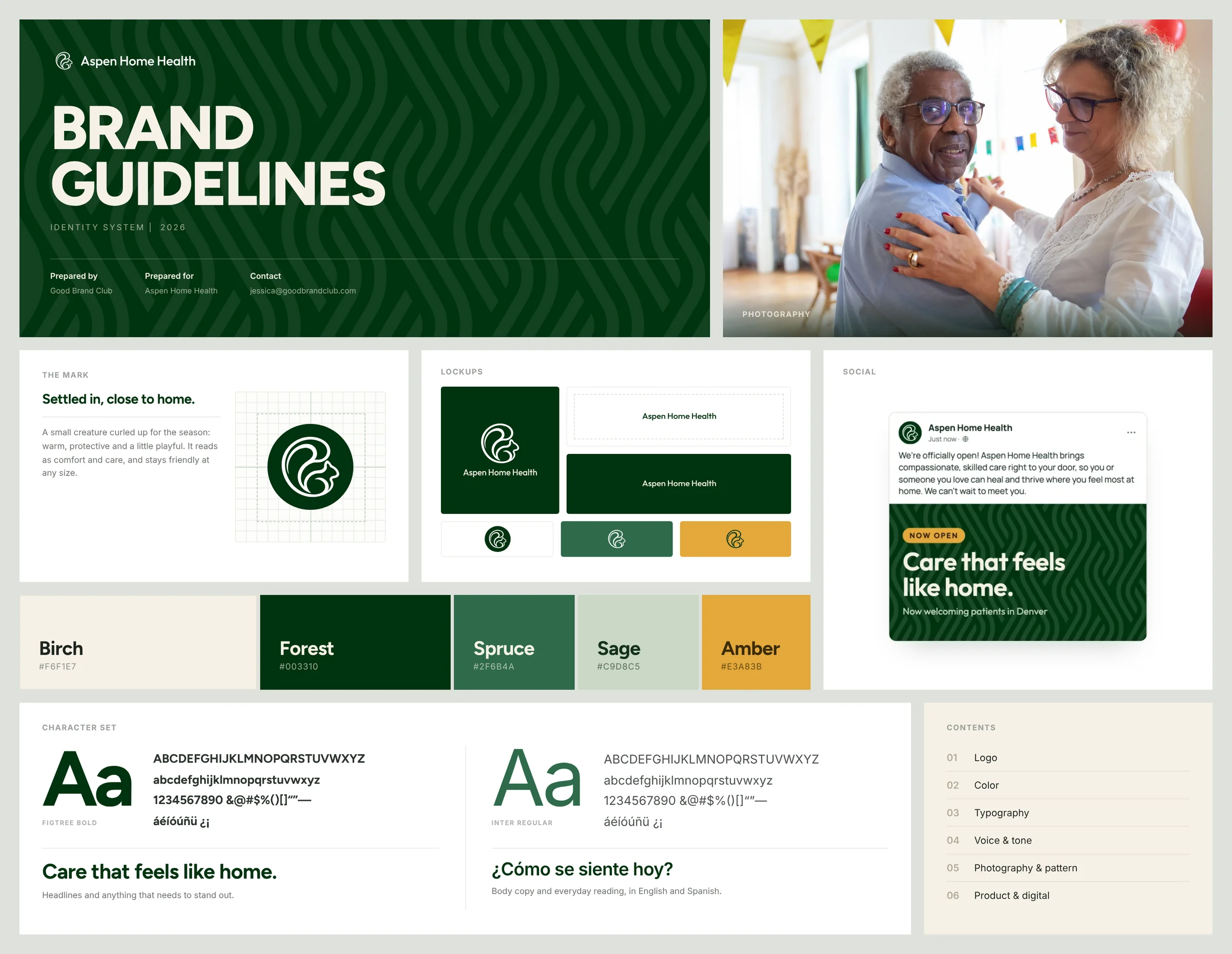
Aspen supports care that happens in someone’s home, so the founder wanted a brand that felt comfortable, friendly and familiar. The new color palette came from mountains and aspens in the fall - deep green, warm cream, golden amber. The old medical cross logo with stock image trees became an abstract squirrel nesting down for the season.
App Re-Design
The home health nurse experience
A home health nurse carries eight or nine patients at once, most of them week after week. They have to stay on top of every one and still finish inside the hours they are paid for. The app follows a single visit, from the drive over to the note that closes it.
WHAT CHANGED FROM THE ORIGINAL
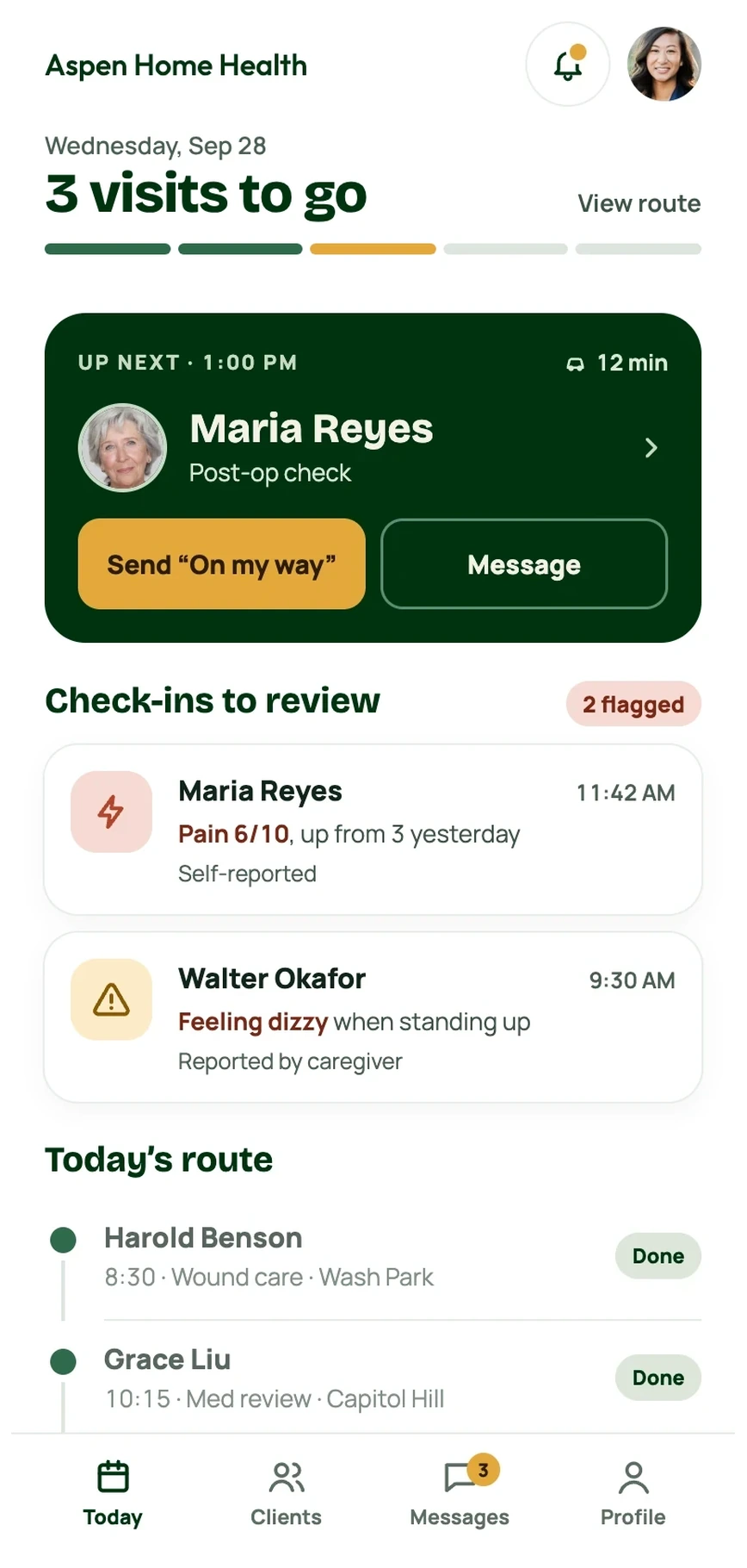
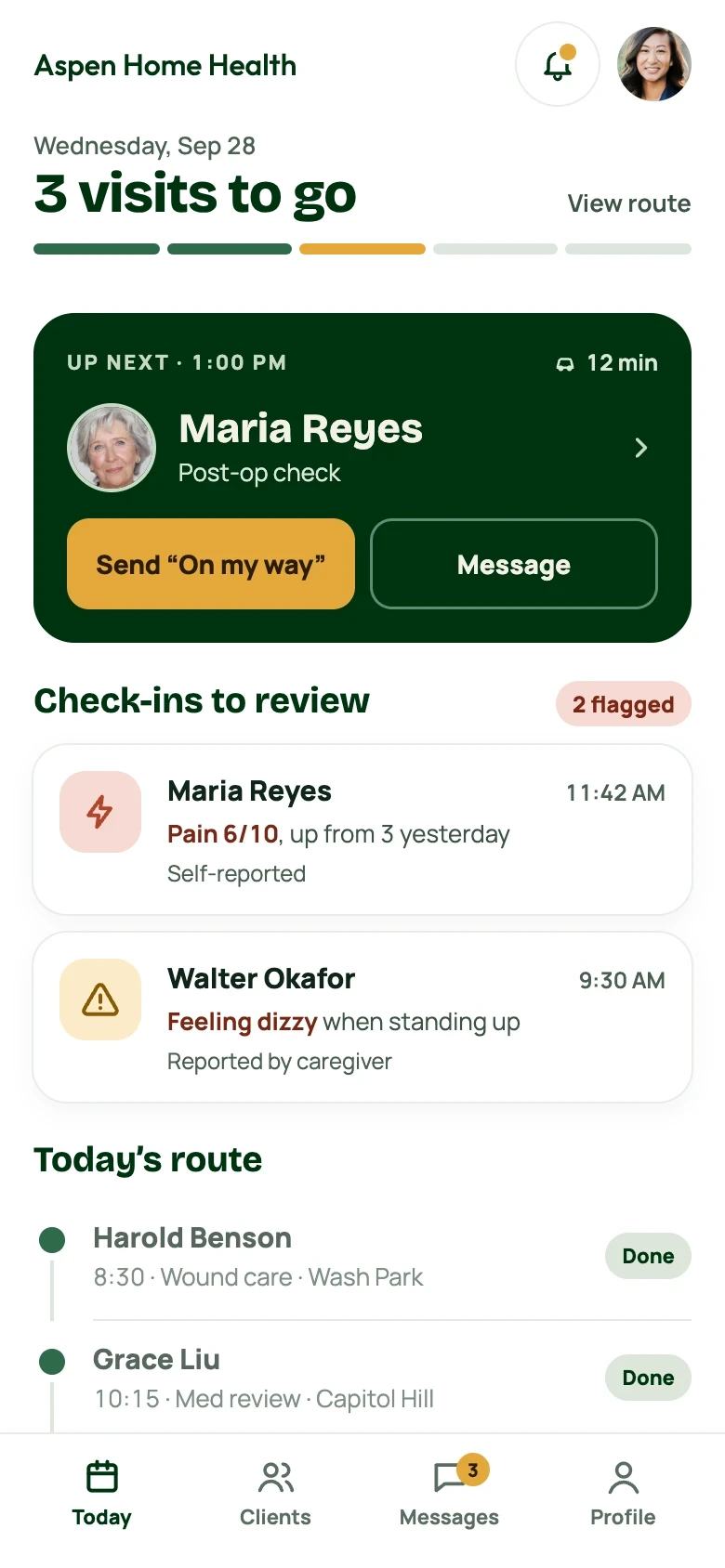
- Hierarchy by what moved, not by what exists. The old app listed every patient the same way. The new home screen opens on the next visit and on the check-ins that changed since yesterday.
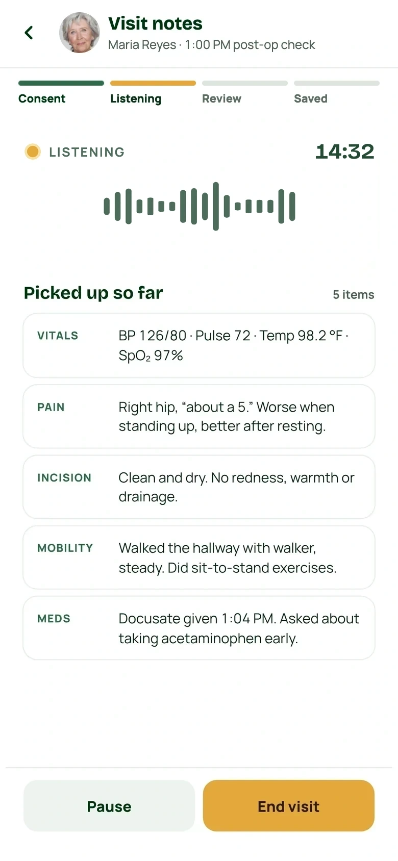
- Consent before capture, not buried in settings. Recording a visit is the most invasive thing the app does, so it asks every time, in the patient’s language, and shows its work while it listens.
- The rest of the day underneath. The nurse's daily route stays one scroll down, so eight or nine patients are easily visible without leaving the home screen.
What should I focus on next?
A nurse starts their day knowing exactly where to go first. The new Aspen home view puts the next patient up front, and shows important information that changed overnight. They can now walk into each visit with less prep time spent up front.
How is my patient doing today?
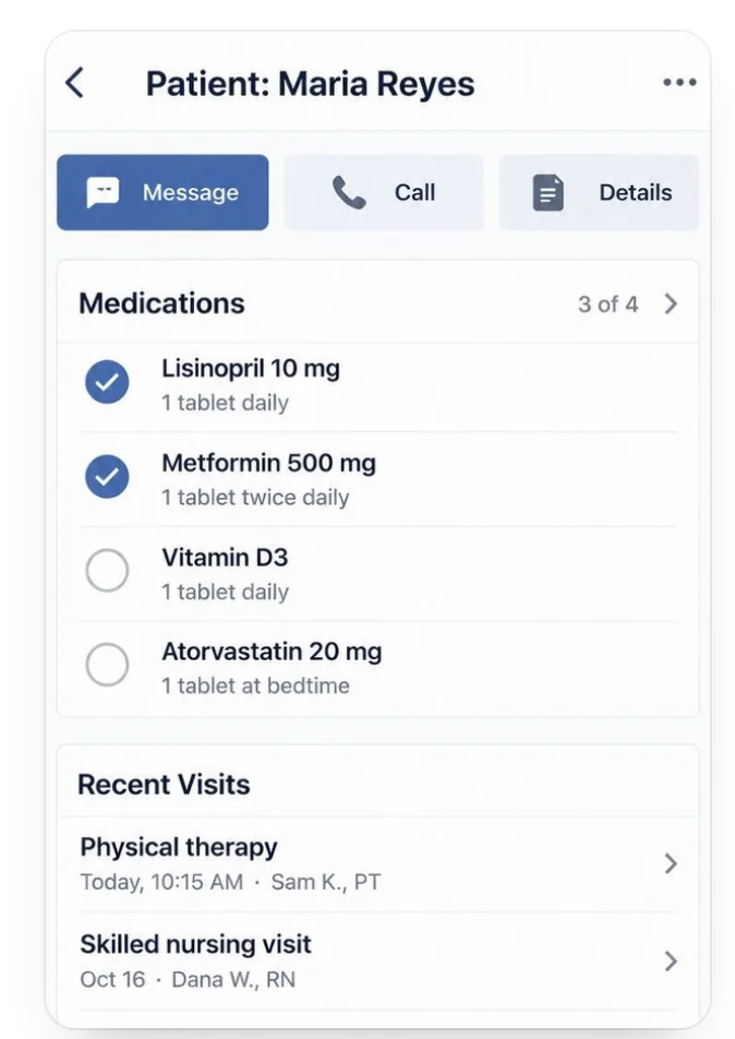
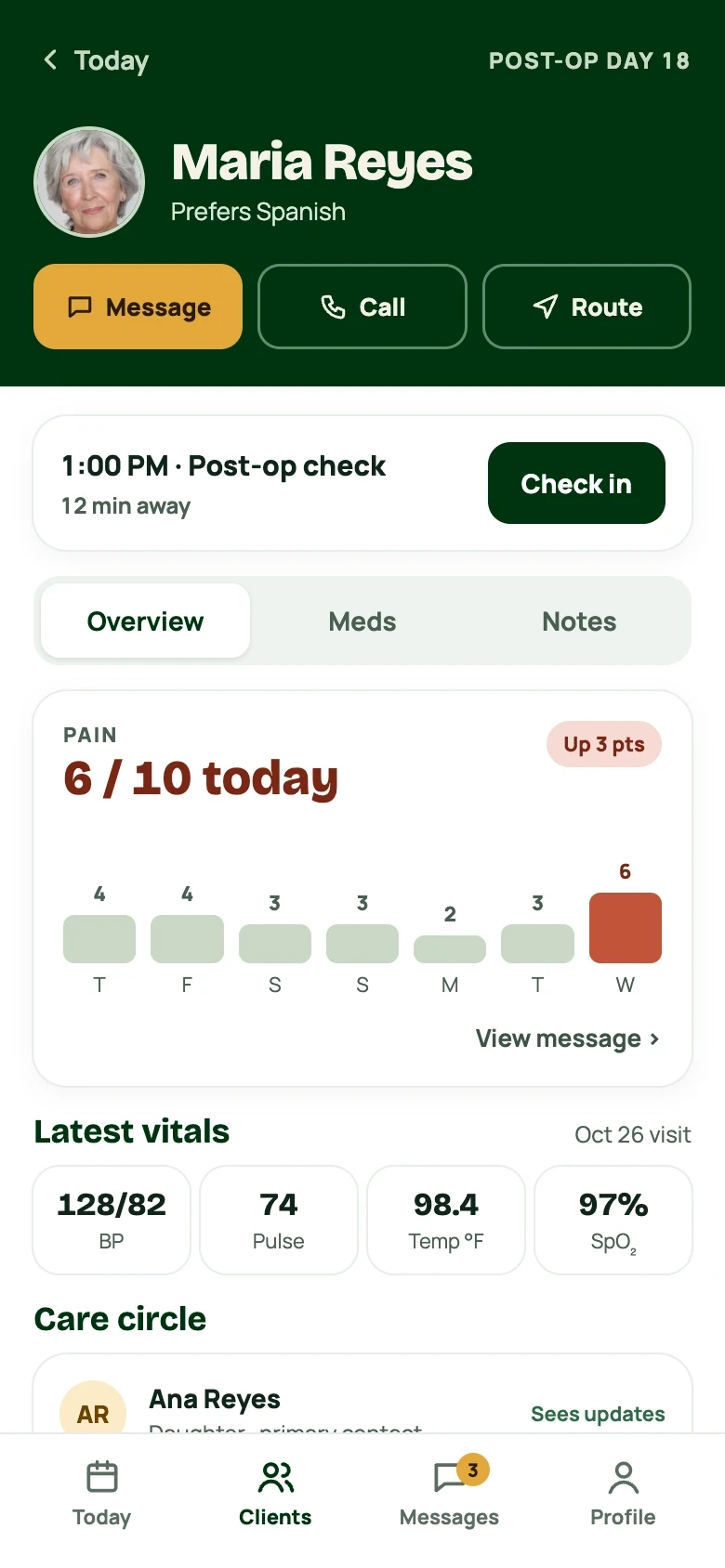
A more focused patient view brings today’s check-in, recent changes in patient vitals, and patient communications into one place, so less of the visit is spent catching up.
I want to give my patient my full attention during the visit.
With patient consent, the Aspen app listens to the visit and drafts notes for the nurse’s chart, so they can stay focused on the visit versus recording details. It was important to design for a patient also being able to view what is being captured as it happens. Transparency and trust was key to this re-design.
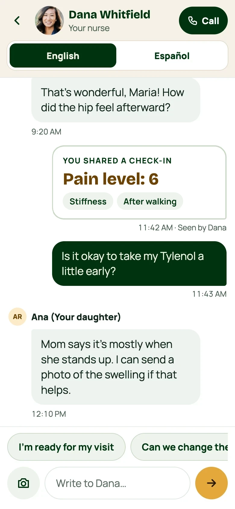
I want to keep all communication in a central, documented place.
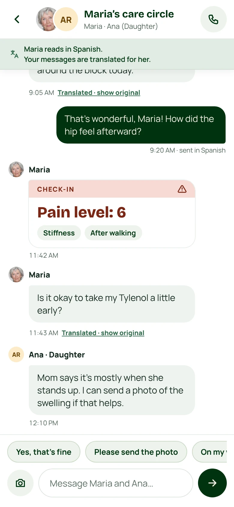
Approved caregivers can communicate in a singular thread alongside the patient and the nurse. Messages can translate both ways if the patient speaks another language, and flagged alerts show up right where everyone can see. This reduces back and forth significantly so the nurse can spend more time on care.
The patient experience
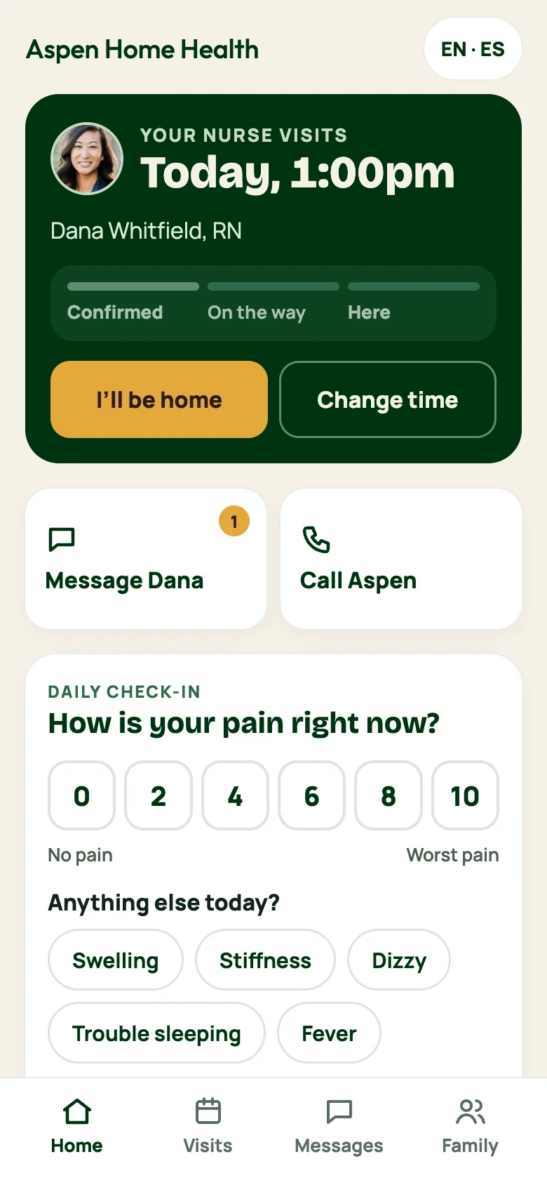
For patients of Aspen, the home health nurse is often their main point of healthcare contact in the first week post op. Especially elderly patients. They often look forward to the visit, and save up questions for it.
The patient app gives them a single view of their own care, who is coming and when, the day’s medicine, and a one-minute check-in. This is a game changer, especially for patients with memory loss.
All of the text can be translated as well. A patient can tap a quick toggle and the whole app translates to their preferred language.
WHAT CHANGED FROM THE ORIGINAL
- Written for the patient, not the chart. Clinical labels became plain sentences: who is coming, when, and what to take today.
- Reporting takes a minute. The old form asked for everything at once. The check-in asks for a number and two taps, and it reaches the nurse before she arrives.
- Language translation affects the whole app, not just one view.
One toggle moves the whole app, and messages translate both directions.
NEXT STEPS
An ambitious healthcare startup with something real to raise on.
I gave Aspen a brand identity and a working app concept that they can take into investor conversations. Nurses and patients now share one app instead of scattered texts and paper notes, and it all runs on a single design system.